Monday, November 29, 2010

PP - Example 1 : B&W with selected colour

As promised, here is an example of what you can do with PP - I'll post some more, but I think each should probably have its own post.

Now, I'm not an expert by any stretch of the imagination - I've seen some things that I just haven't a clue how to tackle, but my philosophy is to break problems down into smaller problems, and tackle them one by one.  So I hope that by giving you a step by step guide to each picture, and my approach, then it'll get your own creative juices flowing, and encourage you in your own projects.
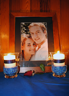
So, to start with, this was constructed from 2 full colour pictures of the same scene.  The first was focused on the rose bud, and this was close enough that the candles were also in focus - but the picture frame wasn't (more importantly - the picture itself wasn't). So I took a second picture, that was focused on the frame and the picture within it.

My first problem, was to somehow get the best bits of each picture together.  Due to the relative complexities of cutting around flickering candles vs. cutting a rectangle from a picture, I used the picture that had the rose and candles in focus, as my base.  Loading both pictures into Photoshop, I used the Polygonal Lasso to mark the internal corners of the picture frame, so I could cut the photo itself (the focused one) and copy it to the other picture.  Once I had it marked, I then modified the edges to feather them a bit, so that it didn't leave a nasty sharp edge.  I had to do a little minor tweaking to make it fit the new frame exactly (ALT + drag a handle expands equally on all sides from the centre; CTRL + drag moves a single corner or side).

So now, my completely focused image (well apart from the frame itself - but I can get away with that, as it is the faces in the photo that are important) comprises of two layers - the original image (background), and the pasted photo on top of it (layer 1).  The next thing was to merge them both into a single layer again (select Layer 1, right click, and Merge Down).  This puts everything back into the background layer again - but notice the little padlock symbol?  You can't make changes to background, so you either need to change background into a real layer (Right click on it and 'Make Layer from Background'), or create a duplicate layer (Right click and 'Duplicate Layer')

Now I wanted to make everything except the rose into monochrome.  There are several ways to tackle this, such as using the Quick Selection, or Magic Wand to select everything you want to change; select everything you DON'T want to change, and then 'invert' the selection; use the mask tool (click Q to get to Quick Mask mode) to paint over everything you want to protect...

The method I chose was to zoom in on the rose, and use the Magnetic Lasso to trace around its outline.  This tool tries to follow edges or changes in contrast, but can get confused if there isn't enough contrast.  If you find it putting new points where you don't want them, just hit the backspace key a few times, and it erases the last few points entered.  Watch the cursor carefully when you get almost back to your starting point, and you will see the little plus sign change to a circle - this means it can recognise the start point and if you click now, it will close the loop.

So, having selected the rose, the next thing was to invert the selection as I wanted to select everything EXCEPT the rose.  To invert the selection, press Shift + CTRL + I (the marquee around your selection won't change, BUT you'll see an extra marquee appear around the edge of the whole image).  Now, anything I do will affect everything but the rose.
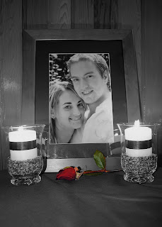
There's a few ways to get the monochrome effect - all of them in the Image | Adjustments section of the menu...
  • Desaturate instantly drains all the colour from the selected part of the image
  • Black and White does the same, but then allows you to play with 'colour' levels - the effect is to change the contrast of the black and white image as though it were taken through different coloured filters - you'll have to play with it yourself - it's a bit difficult to appreciate unless you have used coloured filters for black and white film photography (which most people these days haven't...)
  • Hue/Saturation - this gives slider controls so you can gradually drain the colour, strengthen the colour, or change the brightness - all this can be applied equally to the picture ('master' channel), or individually to Red, Green, or Blue channels)
Personally - initially, I just desaturated it - and got the example above, but then I played with the Hue & Saturation levels to leave a hint of colour - you can see from the original that the frame was a lovely golden colour in the candlelight, and the stones around the candles were bright blue, but all those colours were a bit too strong.  Anyway, here is the finished article - I hope you like it.

Footnote - I did not take the original portrait, and it would be lax of me not to acknowledge the original photographer, though I don't know who that is.  It's not really the 'done thing' to make changes to somebody else's photo - though technically - this is my own photo, that happens to include somebody else's photo in it... so I think I'm covered.

Saturday, November 27, 2010

PP? What's that all about?

I've probably mentioned it several times in previous posts, and just took it for granted you knew what I was talking about - but for those of you don't... PP means "Post Processing".

It encompasses anything and everything that you might do to the image after you download it from the camera to your computer. Actually, many cameras now allow you to apply PP while the picture is still ON the camera - so technically, it is any manipulation you apply after TAKING the picture.

PP ranges from the basic 'crop' (to select the best part of your image), to slightly more advanced manipulation of contrast or brightness of the whole picture or removing red eye reflections, through to advanced manipulations involving multiple images in layers like a stack of pancakes, with bits erased here and there so different layers show through, effects such as sepia applied, blurring backgrounds, sunny skies removed and replaced with moody stormy clouds... the possibilities are limited only by your imagination (hey - that sounds like a great tagline... uhm...)

So what do you need to 'PP' your pictures?  The ultimate tool, and probably the one most professionals and enthusiasts use is Adobe's Photoshop.  However, it IS expensive (note to Adobe - please make it more accessible to the rest of us), and there are alternatives available.  The GIMP is free, and has a lot of the most commonly used Photoshop capabilities.  Adobe also has Photoshop Elements, which is a simplified version of Photoshop with an easier interface aimed at the 'consumer' market, and also Lightroom which is kind of a halfway house - a simplified version of Photoshop but aimed at the 'prosumer' market (I hate that word - so pretentious).  Other programs also give access to various levels of manipulations, such as FastStone Viewer, or the Apple Mac's iPhoto application.

Many web based photo albums, such as Picasa, photobucket, flickr, facebook, and more, have links into an online tool called Picnik, which gives all kinds of cool fun effects you can add to your photos, though it is aimed more at the fun effects, rather than as a serious contender for a Photoshop replacement.  You can also use Picnik directly on the pictures from your own PC.

So, apart from removing red-eye from Aunty Mabel, cropping the picture so cousin George is no longer in it, and boosting the contrast on that rather washed out landscape that you accidentally over-exposed... what can you do with PP?  What is the point?

In the next post (and I promise to put some pictures in that one) or soon anyway - maybe not the very next post... I'll give you a few examples, and talk you through how they were created.

Till then,
Happy Snappin

Thursday, November 25, 2010

Into the light... take 2

Same bungee trampoliney thing, but this time at my niece's school fair, so the queues weren't nearly as bad - and look - blue sky :)

I'd learned some lessons from the previous attempt (see September's posts), and with the clear blue sky, there was a definite source of light rather than just a general bright backlight.  Luckily, the sun was behind me over my left shoulder, so I wasn't having nearly so many exposure problems this time.  It was so bright that I was getting exposure times in around the 1/1000th second area, though this was again using 200 ISO and aperture priority set to the widest aperture (this automatically adjusts to maintain the widest aperture possible as I zoom in and out).

I set the Exposure Compensation to +2/3 of a stop - with the sun so bright, I was getting quite contrasty shadows.  I knew that the on-camera pop-up flash wouldn't be anywhere near strong enough to make any difference as a fill-flash, so the idea was to use Exposure Compensation to try and lighten the shadows a bit.  I haven't done any PP work on the lighting side of the picture, so I think I got it about right (more by luck than judgement).

The other two things I did were to set the auto focus to continuous mode, and set the shutter to burst mode.  These two settings allowed me to concentrate on panning up and down and zooming in and out to get a good composition, while the camera maintained the focus all the time, and I could just hold the shutter button down and fire off 4 or 5 shots in a row.  Last time, I was quite horrified to find I'd taken 70-80 shots... imagine my surprise when I found I had taken 327 this time :-o  By the time I weeded out the ones that hadn't focused, that had her feet or head or something out of shot, and all the ones where she was at the bottom of the cycle (there was some background clutter that made these less attractive), I got down to 77, but a lot of those are pretty much the same with very little to choose between them.

I ended up choosing this shot and cropped it in tight to the top half of her body (the whole shot was full length), so that we can see the expression of joy on her face.

Hope you like it :)
Till next time
Happy Snappin'
G

Wednesday, November 10, 2010

The rule of thirds

In a previous post, I mentioned cropping a surfing picture of my son’s friend, Mike, so that it conformed to the ‘rule of thirds’.  So what’s that all about?

sm DSC_1755_thirds
In simplest terms, if you imagine a noughts and crosses grid over your picture (or tic-tac-toe, depending where in the world you grew up), then this divides the picture into 9 blocks – you’ve split it into the ‘thirds’ that the rule refers to, both vertically and horizontally. 

The idea behind the rule is that by placing elements of the picture on the lines that mark the thirds, or on the points where lines cross, the resulting image is more aesthetically pleasing.


Below, I’ve got 3 versions of the same picture (I’ve tried to keep them all with the same 6x4 aspect, and the same level of zoom, to make comparison easier).

The first two versions centre Mike in the picture, which often seems the correct thing to do when taking the picture.  One is centred on his body and doesn’t look too bad – but it’s a typical holiday snapshot, the image lacks space and movement.  The second version centres on Mike’s head, and is just plain wrong on many levels… there is too much wasted space above him (so much so, that to get the same level of zoom, it actually went beyond the bounds of my original photo), and it almost looks as if he is running out of water and grinding his board into the bottom of the photo. 

DSC_1755 body


Centred on body
DSC_1755 face


Centred on head


(If you are wondering about the skewed top edge in the second shot, it’s because my horizon wasn’t quite straight originally, and so I had to apply some rotation to the whole picture to straighten it out…)


DSC_1755_crFinally, here again is the one I originally posted, that uses the rule of thirds as shown above, to place Mike on the left line (well almost – I didn’t actually have the grid when I did the crop, so it was all judged by eye), and the line of the wave along the bottom line.  As you can see in the ‘gridded’ version above, by happy accident, the following wave is just starting to break and lines up nicely with the top line on the right. 

Compare this version of the picture with either of the two versions above, and you’ll (hopefully) start to see this one has a certain “je ne sais quoi…” (something or other) about it, that transforms it from a ‘snapshot’ to an ‘image’.

If you want to learn more about the rule of thirds, and other compositional concepts such as ‘Lead Room’ (that’s the space ‘in front’ of the subject that the subject is moving into or looking towards…), ‘Head Room’ (that’s the space around someone’s head in a portrait type shot), or the ‘Golden Ratio’ (not sure I get this one, but unless you are handy with a slide rule and have a degree in geometry, it’s more likely to just ‘look right’ as opposed to understanding the maths behind it), then have a look around the net.  Wikipedia is always a good starting point.

Until next time,
Snappy Happin’
Grum

Tuesday, November 9, 2010

Canberra revisited - Remembrance

You may remember back in June, I visited Canberra, and got some shots of the War Memorial at dawn.  Well this weekend we went back, and I was able to have half an hour there for myself in photo-mode during opening hours. The Roll of Honour was my target this time - especially being so close to remembrance day. 

You may remember me mentioning that I had in mind a shot exploiting DOF and a shallow angle along the wall, to have a single poppy in the foreground in focus, with a background looking like a solid wall of red, from out of focus poppies seen from a shallow angle. 

Here's what I got...  I was pleased with it, but it's not perfect... I liked the fact I had people way off in the distance, as this gave a sense of scale and distance, emphasising how far the wall stretches, but I didn't like the blank field between the cluster of focused poppies and the start of the de-focused poppies after the next panel.  If the panel had names on it, this may have been more interesting visually, but I didn't think it was too respectful to start shifting poppies about, just to suit my vision.

So, to get the DOF, I shot with my lens wide open (f/5.6 @ 55mm).  I felt that 55mm gave a good balance to the depth without foreshortening it (longer focal lengths) or showing too much extra stuff that I'd only want to crop out anyway (shorter focal lengths).  I pretty much always shoot at ISO100 - so I don't need to tell you that... the light conditions forced me to hand-hold at 1/30, but since I wanted a shallow angle of view, I was able to brace myself right against the wall (being careful not to dislodge any poppies, of course).

Yes - I was pleased with it. Could do better, but it'll do for now.

Until next time
Happy Snappin'
Grum.

Wednesday, November 3, 2010

Back in action


You will have noticed that I haven't posted in a while.  I've had a busy few weeks organising my son's wedding and hosting guests from abroad - so no spare time for fun photography, or blogging, etc.  But I'm back now, and yes - the wedding was a great success and the sun shone from a brilliant blue sky right up until they left for their honeymoon (thanks for asking).

So, what to post?  Well, while I was acting as host and tour guide to the best man, who had travelled over here from the UK, we visited the Motor Show in Sydney, went surfing, went to the wedding (obviously), and then the whole party went on a jetboat tour around Sydney Harbour the day after the wedding (it was pretty miserable weather, but they were going to get drenched in seawater anyway...)

I've already posted the best of my Motor Show shots on flickr and some on DPS, so I'm not going to repeat them here (just follow the links from the sidebar if you want to see them), and I'm not sure I should post the wedding shots, so that leaves... surfing :D (at this point, the chorus of the Beach Boys "Surfin' USA..." should start playing in the back of your head - and now that I've suggested it - it's going to plague you for the rest of the day...)

So - some things to consider for surfing pictures...

  1. It is inevitably going to be windy, with sand and/or salt spray blowing around.  You don't want this inside your camera, so go with the correct lens already in place - or go back to the car if you need to change lens at all.  Probably also a good idea to have additional protection such as a UV filter on the lens, and a plastic bag around the bulk of the camera - especially if there is a lot of salt spray around, and some sunblock for yourself (but DON'T keep it in the camera bag... you just KNOW the tube will split, or the top come off, and cameras don't really need or like sunblock)
  2. If you are taking pictures from the shore, the action will be far away - you'll need a longish lens or lots of extra megapixels to allow you to crop later without losing resolution.  My 200mm could've done with another 100-200mm to get me closer in, since my camera has a (normally quite adequate) sensor of 10MP only.
  3. If you are out on the water either in a boat or on a board yourself, then a waterproof camera or casing is probably advisable ;-)
  4. Some locations may offer the chance to get out in the vicinity of the surfers via long jetties or headlands that stick out into the water - take advantage of these for sideways action shots along the line of the wave, if they are available.
  5. If you've got really big waves, keep down low so that you can see them towering above you (and the surfers) and always get a surfer dude in the picture for scale.
Well, I was on the beach, head on to the waves, with the odd big wave but mostly just a gentle swell, and a nervous surfer on a brand new board (that he had blown half his holiday money on in the first day), with tales of blue-ringed octopus, great white sharks, and blue-bottle jellyfish someone had very meanly implanted in his brain (poor kid - mwah-ha-ha!).  This was obviously not going to be a spectacular shoot, but I wanted to get some shots of him on his new board, that he could take home to his proud mum and surfin' buddies in England.

I had the camera set to 'continuous' focus mode, so that it would automatically keep in focus as he was riding the waves in.  I could have used aperture priority and selected a small aperture to give me a large depth of focus (see Lesson 03 from August), though this would've meant longer exposure times and risked potential blurring given that I was at extreme zoom.  It was actually a lot brighter than I realised, and at f/5.6 I was getting shutter speeds of around 1/800 to 1/1000, so I could possibly have gone to f/8 or f/11 with a fixed manual focus point, and just relied on DOF rather than continuous focus - but what the heck.

After missing several shots, I realised I should also be in 'burst' mode, so I could fire off a handful of shots and capture the entire period from getting up on the board to getting dunked again, though his runs frequently lasted only enough time for me to get three or four shots in, even in burst mode (LOL - sorry Mike ;-) but it's OK - nobody actually reads this, so your secret is safe).

You'll need to be patient if you are following a particular surfer, as one good ride that lasts 5 or 10 seconds means a wait of 5 minutes while they paddle back out again, and then another 5 minutes while they get their breath back and wait for the next good wave.  If you are shooting a competition or a busy beach, then you are more likely to have continual action to choose from.

Finally, when I got home and zoomed into the tiny specs in the middle of my pictures, I was able to crop and get a few reasonable pictures, such as the one above, that retained enough pixels to still print out at 6x4".  This is one of the few occasions I'd agree that a 20MP camera is worthwhile - but if you are going to be getting serious and regularly shooting surfing action, then you'll probably not be content with your entry level dSLR and kit lenses anyway.

You'll see that I cropped this one using the rule of thirds (with Mike towards the left of the picture, and the line of surf in the lower portion), giving him room on the right to surf into - this is just a trick of composition that adds to the 'dynamic' of the picture - but that's a subject for another day.

Till the next time,
Happy Snappin'

G